
Years ago, you could walk into a McDonalds in Tai Pei, Taiwan, and other than the addition of Chinese characters to the menu board, the restaurant looked like it could be in New York City, or anywhere in the world. The restaurants’ design were consistent so customers would feel comfortable and confident they would receive the same experience no matter where they went for a Big Mac. Many large corporate retail chains did exactly the same thing to ensure a seamless customer experience. I used to consult for United Rentals and went into 10 of its locations in Northern California in two days. Other than different layouts and merchandising standards, I couldn’t tell one from another. The same went for American Express Travel offices throughout the United States. I visited 104 of them as a visual-design consultant and each was very similar.
In more recent years, McDonald’s is creating more interesting, location-based designs for their outlets to honor each locale rather than their older cookie-cutter look. The emerging trend for smaller chain stores is to create unique looks for each location.
Where to Be Consistent
Your logo, and how it’s presented, should stay the same from place to place. Your outdoor signs need to have the same logo, colors and wording. With different architecture, space and local sign regulations, you’ll need to be creative with your signage, but the basics should stay the same and be rearranged to fit each locale.
When possible, store façades ought to be the same color/color range. If your façade is a beige tone, any beige will work as long as they feel similar.
If you have a date-sensitive promotion that is going on in all your stores, your window signs should be the same in all locations. Colors and content can be the same even if the size and layouts are designed to fit different windows.
The same goes for interior signage. Try to have the same floor-standing sign holders as well as consistent sizes/materials/shapes of sign holders in all your stores for the spas, shelves and any walls. Sign location matters: Floor-standing signs need to be in the same spot next to each spa; signs on the spas also in the same spot on each spa; shelf signage stays consistent from shelf to shelf so customers don’t see little dots of signs scattered randomly.
Wall signs should be hung consistently throughout the stores. If possible, the bottoms of hanging signs should be 7 feet and 6 inches off the floor. If you only have 8-foot ceilings, skip hanging signage completely. Hang your promotional signs in five focal areas rather than scattered all over the ceiling. They can distract and detract from your merchandise below.
Presentation must be consistent across all locations. Keep clutter to a minimum; all product labels face front; no visible dust; bathrooms are clean and neat; all bulbs are lit in your light fixtures; nothing is blocking easy passage throughout the store; and your floors and walls are clean.
Jon Weiss of Spa King in southern- and mid-Florida has a spa bargain warehouse feel in his stores but looks for consistency in his merchandise assortment. Weiss works with his manufacturers to make sure he can get the same products in all three stores and keeps the bulk of the spas in his central Port St. Lucie warehouse. It’s one hour from each of his other stores, allowing them to be smaller and more efficient. His printed signs use the same color schemes and images, and he uses a lot of vendor signage that gets distributed equally to each store.
The Hot Tub Store has five locations in northern California, and president Sky Matula treats all his locations like one store. The overall aesthetic for the stores is rustic modern, nice looking but not too upscale. His main product is Hot Spring Spas, and the store matches that look and feel.
Matula works with Google Docs so each salesperson in all locations has access to the same pricing, documents and promotions. With two to three people per store and the stores spread from 90 minutes to two hours apart, Google Docs plus conference calls help these separate locations feel like one large team. They encourage, support and share ideas. His management team trains sales staff to deliver a consistent message in their own style. Teamwork reigns and is working very well for this chain.
Matula has completely remodeled his showrooms in the last two years. Each location has the same paint colors and matte-finished, raw-polished concrete floors. He’s working on switching the lighting in the stores to LED. Each store uses kitchen-grade stainless-steel rolling racks for chemicals and accessories, trying not to display too much, as he wants customers to feel owning a spa is easy. His signs and sign holders are consistent across the stores.

Where to Be Different
Your store layout can change depending on the architecture and dimensions of each location. If possible, keep the wrap desk in the same area of each store.
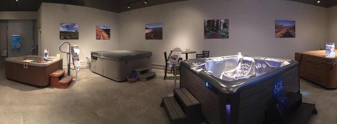
Each of The Hot Tub Stores in California has beautiful landscape photo blowups printed on canvas that reflect their surrounding areas. Matula took the “windows to where we live” photos on his iPhone and had them blown up. Also, his photos are immediately recognizable as being local, which makes them even more appreciated.
A place to create a locally oriented image is on a large blank wall in each of your stores. It could be an oversize photo blow-up that shows something that relates to the town or city of that store. You can use Photoshop to superimpose a popular spa model in front of the view, as if someone is in the spa looking at the mountain. Each state, city and town has something that sets it apart, even if it’s a local building. If you can’t figure out anything unique for one store, consider a blown-up map of your selling area with colorful pins or flags wherever you’ve installed a spa or pool. Frame it out with painted-wood molding, which is less money than formally framing a huge map.
If any of your sales staff own a spa from your store, think about large photos of that person either in their spa or standing nearby. This personalizes the experience, and customers may enjoy the double take of seeing the person in the photo right in front of them.
Whether your stores are warehouse, middle-priced or upscale, having some visual, merchandise and tech consistency across each location can help your staff feel like a team and your customers see you’re paying attention to all locations equally.


Linda Cahan is an internationally known expert in visual merchandising strategy and store design. She gives seminars, workshops, trains and consults for chain stores and independent retailers. Along with SpaRetailer, she writes for several other retail magazines, and is the author of two books and seven corporate visual standards manuals. Cahan lives in West Linn, Oregon. lindacahan.com