Pricing, Signage and Your Image
Tips for displaying prices in the showroom
I went into a hot tub store a week ago. There wasn’t a price in sight. Not one. Nothing on the spas, zip on the accessories and chemicals. I was curious and asked the manager why. “We don’t need to!” he said. “People are just grateful to be able to buy a unit!”
May the good times continue to roll!
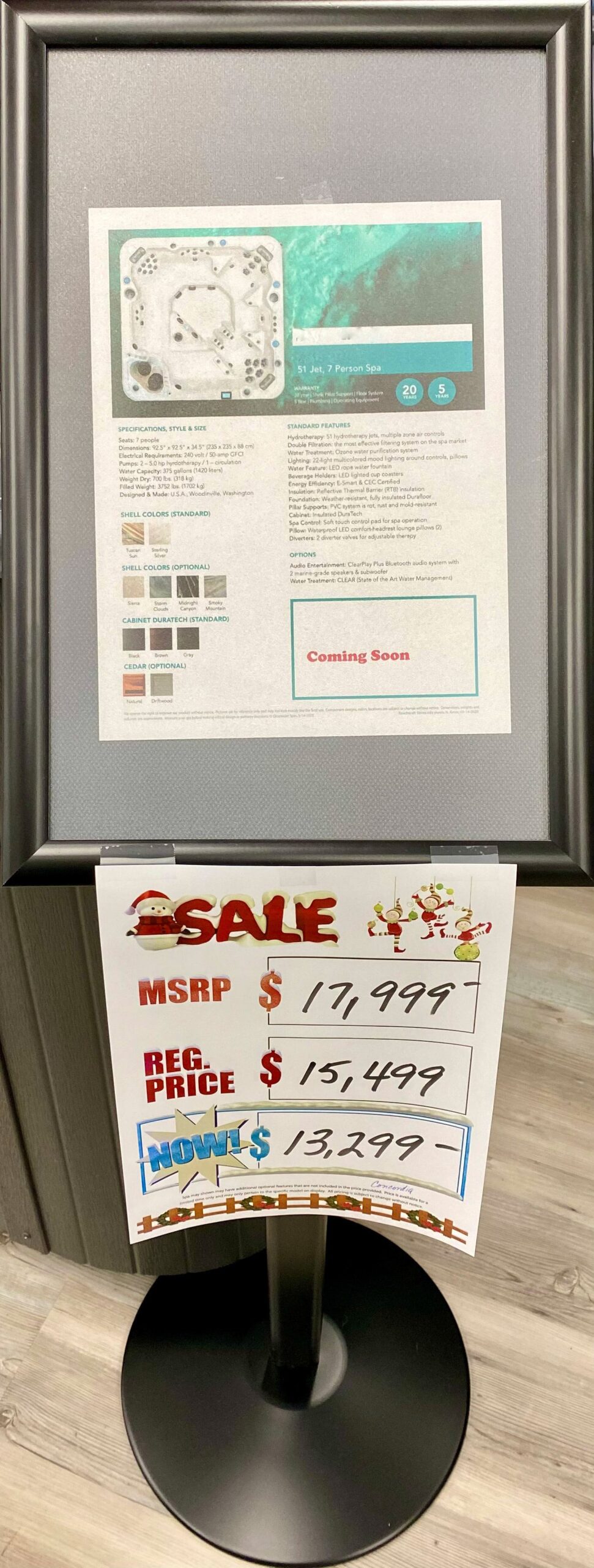
From there, I drove to a spa retailer that opened a few months ago. They use pre-printed sale signs with space to write the prices with markers. The MSRP is printed on the signs, the regular price and then the store’s seemingly discounted price. The paper signs were printed on 8.5- by 11-inch paper but put into sign holders designed for 11- by 14-inch paper. The signs were floating haphazardly inside the holders.
There was a strong visual difference between these retailers. The first one, with no signs, looked clean and fresh. The second store looked like a discount store.
Which approach is better? Unlisted prices can feel daunting and unempowering. The saying goes, “If you have to ask, you can’t afford it.” In the store with all the signs, at least you know where you stand pricewise. However, even though the hot tubs were labeled, the chemicals and accessories weren’t priced. When I asked about it, the salesperson told me customers just had to come up to the desk, he’d scan the product — and that’s how they would both learn the price. If I were comparison shopping for a chemical or accessory, price has something to do with the comparison.
There are many things you want your customers to feel: excited, confident in the quality of the products and to know you’ll take care of them with installation, service and standing behind your products. You don’t want them to feel misled, uncertain about the decision, taken advantage of and, especially in this climate of uncertainty, unempowered. Knowledge is power.
You don’t want them to feel misled, uncertain about the decision, taken advantage of and, especially in this climate of uncertainty, unempowered. Knowledge is power.
Basics of excellent product signage
Content
Good signage gives customers what they need to make a decision or ask the right questions of your staff. That said, many people don’t read a sign if there’s too many words. As soon as they see a full paragraph, a switch goes off in their brains and they turn to the first person they can ask. Please use the KIS rule when adding signage, especially pricing signs, to your store: Keep it simple.
One of the most difficult things for a copywriter to do is edit. That’s where KIS becomes so challenging. Keep editing until what you end up with is short, accurate, descriptive and sweet.
Contrast is king
I have yet to walk into a spa store with fabulous lighting. Yes, they’ve all been lit to the degree that you can see the spas and the signs. But unless a spotlight is trained on the signs, they are often in fairly low light. A strong contrast can help customers see what they’re reading. Our eyes start losing their ability to distinguish type as we age. If a sign is attractively chic, such as a medium blue on a soft green paper, it can look lovely — but the contrast between the letters and background isn’t sharp enough for older people, especially in a store with overhead fluorescent lights and no LED spotlights. Dark type on a very light background is best for people over 45. For younger people, white or light type on a dark background is fine, as well as fashionable and elegant. As eyes age, white type on a dark color vibrates or shimmers, and not in a good way. It creates eye strain, and people stop reading if there’s a lot of information.
Size matters
As we age, our up-close vision degenerates. People will put on reading glasses if they have to but often prefer not to, or they can’t find them in their pockets or handbags. Sixteen-point type on signs is as small as you can go — and that’s for fine-print information.
Consider 20-point size type for standard features. Twenty-four-point size type is good for listing specifications, style and size. For headlines and attention-getting statements, use at least 34-point type.
16 point
20 point
24 point
34 point
Fonts are the next thing to consider. The easiest to read font is sans serif. That means the letters don’t have extra flourishes at their ends. Times New Roman has small “extras” at the endings of each letter. But as they are small, this is a very readable font.
Some other easy-to-read fonts for the bulk of your signs are Helvetica, Arial, Georgia, Futura, Tisa, Calibri and Verdana.
Kerning
The space between the letters and words can make or break your signs. When letters are too close together, they become difficult to read. Too far apart and you have the same problem.
For example:
45 Hydrotherapy: multiple zone air controls – normal spacing
45 Hydrotherapy: multiple zone air controls – way too close together (condensed by 0.6 points)
45 Hydrotherapy: multiple zone air controls – too far apart! (2.3)
45 Hydrotherapy: multiple zone air controls – easier to read (0.9)
Paper quality matters
When you are printing on paper that was on sale at the big-box office supply store, it tends to look cheap and a little see-through. Invest in the better quality, slightly heavier paper. You’re selling expensive spas! Better paper is at least 28 lb. The paper you find on sale is almost always 20 lb. Please buy the good stuff. It is a subtle but influential choice.
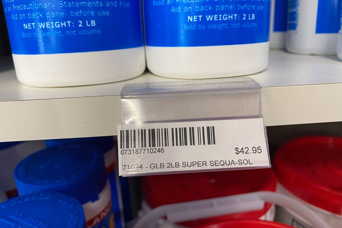
Referencing the store with the pre-printed sale signs, having your signs printed in advance can be a great idea if you change pricing fairly frequently. If you print signs in advance for special holidays in bulk and plan to use those signs yearly for several years, you will save money. But please make sure the pricing is written in excellent handwriting with a wide-tip marker. Consistency is vital so the pricing looks professional and not hodge-podge. Finally, please price your accessories and chemicals. You’re in retail, and stickers are part of the deal. It’s annoying for you but a gift to your customers. At home, the saying is “Happy wife, happy life.” In your store it’s “Happy customers, happy profits.”