Move It, Move It
Smart retail layouts that encourage browsing and buying
Movement creates interest, and interest creates sales. Whenever sales are slow, take a cue from the song “I Like To Move It” from the “Madagascar” movies. Rearranging your showroom can energize you, your staff and your customers. So, move it, move it!
Human nature favors wandering and discovering. Anthropologists studying the Hadza, an isolated hunter-gatherer tribe in Tanzania, found that people naturally explore by moving toward what catches their eye, then scanning for the next interesting thing nearby. In retail, that means shoppers enjoy meandering through inviting, organic paths — not trudging down straight, predictable aisles. When redesigning your floor, think “pods,” not rows. Crate & Barrel’s founders displayed merchandise on the crates and barrels it arrived in, grouping items that made sense together. Customers would explore one pod, then notice something enticing in the next. The concept worked exceptionally well for the company, and while the kitchen tools area now has straight aisles, the rest of the store still flows from pod to pod.
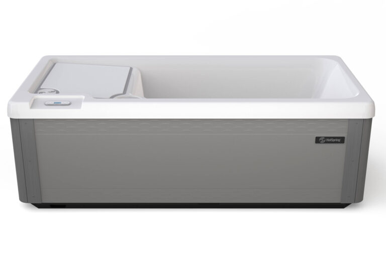
Hot tubs lined in a row can blend. Instead, group three or four spas by theme — family, wellness/therapy, entertainment — and add elements that bring the category to life: large graphics, plants, accessories and even themed chemical displays. Keep your bulk stock in organized aisles, but “romance” the pods so customers can picture the full experience — just like outfitting a mannequin.
Key areas to get right:
Entry: Create a decompression zone — 6-8 feet of open space — to let customers orient themselves upon entry. Use this area for a showpiece spa staged like it could be in their backyard. This area can also feature walk-off mats, which help prevent slips from rain, ice or snow while trapping dirt from outside to keep your floors cleaner and safer.
Checkout counter: Place the counter midway along the left or right side, with a clear view of the floor. Staff should be able to greet customers naturally without hovering at the entrance.
Lighting: Plan lighting after pod placement. Illuminate merchandise, not empty floor space. If your store/showroom is long and narrow, add more light to the back of the store to attract customers to walk in farther. Warm light works best at checkout and consultation areas; avoid harsh, cool-toned LEDs. If possible, use table lamps rather than overhead lighting for person-to-person transactions.
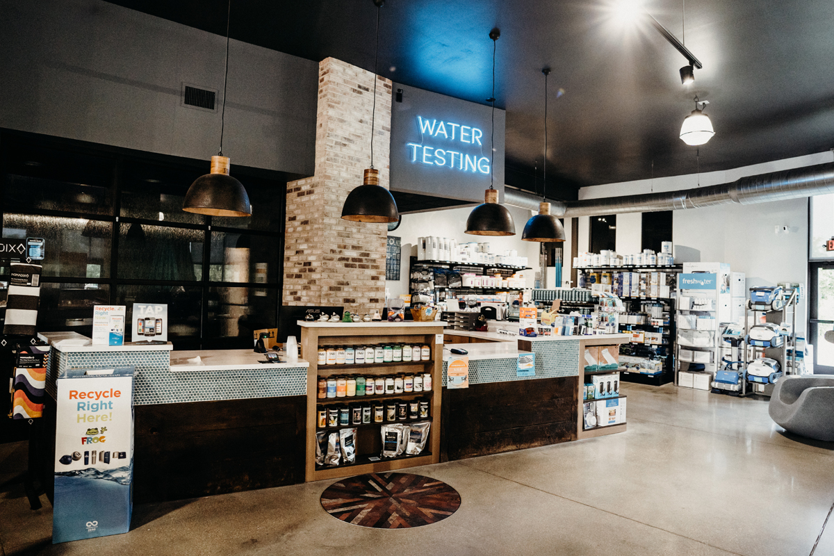
Water testing counter: Position this near chemicals or accessories, ideally along a path that takes customers past seasonal goods. If needed, an overhead sign can make the area visible from the front door. Include comfortable, sturdy chairs with arms for those who may need them and leave room for people standing in line.
Avoid dead zones: Watch for things like poor lighting, low-hanging overhead fans, floor level changes, L-shaped areas and merchandise blocked by columns, walls or fixtures.
Your showroom is more than a place to display product — it’s a stage for storytelling.”
Finally — walk through your space. A layout that works on paper can feel different in reality. Blue tape on the floor is a surprisingly effective way to visualize new arrangements. Your showroom is more than a place to display product — it’s a stage for storytelling. When the flow feels natural and engaging, shoppers stay longer, explore more and connect with what you’re selling. Keep your space fresh because movement isn’t just about rearranging tubs — it’s about moving customers closer to “yes.”