Green Equals Growth
Color options for a store refresh
The green and blues we see when viewing our planet from space are among the most popular colors worldwide. Green can represent growth and nature while blue can remind us of water and the sky on a nice day.
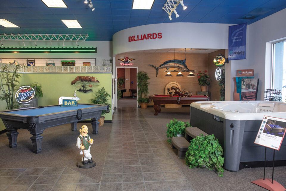
Most of the spa stores I’ve visited use blue as an accent color. It makes sense with water-related products. But because so many stores use blue, consider incorporating green into your stores’ color theme. Green truly does equal growth. In the United States, green is also the color of money. Green is calming and helps people forget about time. People will shop longer in a green environment.
Green boosts our appetites. We unconsciously see green as being healthy and clean. That, combined with losing our sense of time, encourages customers to shop longer as they develop the desire to consume. Customers = consumers.
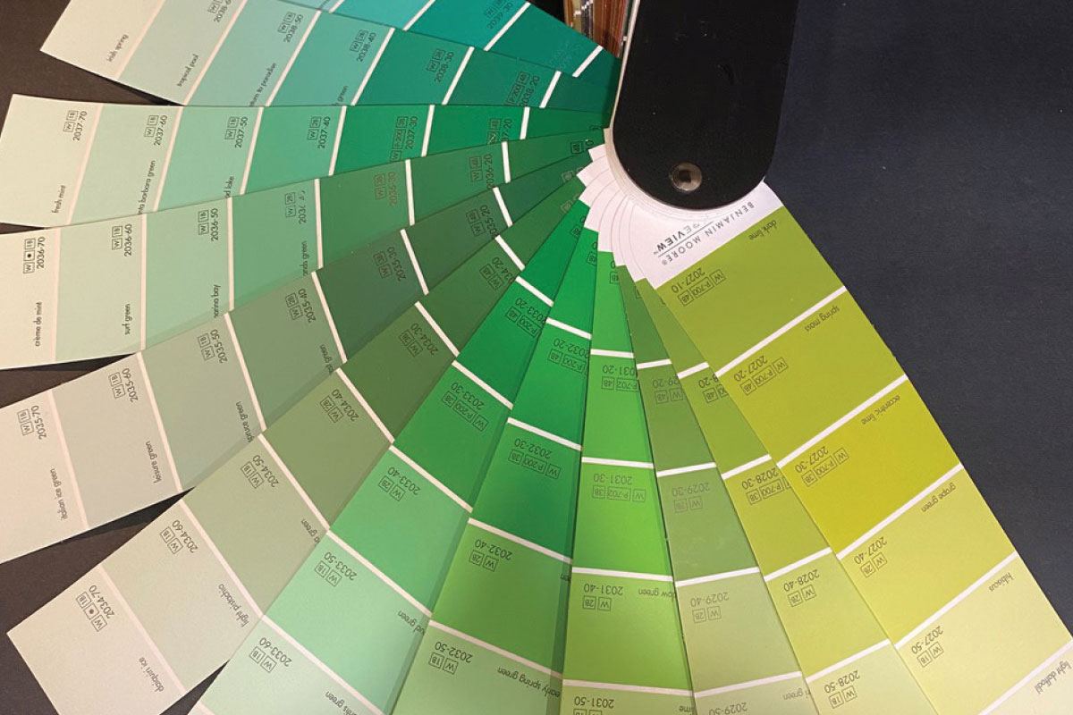
Different shades of green evoke different reactions. Lime green feels vibrant and young. Because of its yellow tones, it pops and would be best for a smaller focal wall. Forest (deep) green appeals to wealthier people, while emerald green is for everyone. Forest green is ideal for a wall that houses lighter-color merchandise or has spas lined up against the wall. Place some good-quality fake pine trees of varying heights in front of a dark green wall, and it will give the illusion of a forest. Soft muted greens such as a gray/green or celadon are more sophisticated. While dark or soft/muted greens are calming. Emerald, lime and grass greens bring energy and focus. When we’re exposed to colors from nature, especially indoors, we experience a feeling of rejuvenation.
While yellow is the first color the retina of our eyes perceives, green is one of the easiest colors for us to take in, which helps soothe and destress us while in a green environment. That’s why time ceases to exist.
I’m not suggesting you paint all the walls green. Depending on the size of your showroom, that could be a little overwhelming. Some colors that work well with green are soft yellows, tans, some blues and, believe it or not, oranges. When choosing colors for your store, look first to colors seen together in nature. For example, you may see green leaves against a light blue sky by a sandy beach. That gives you a leafy green, sky blue and a taupe/sand color combination — all perfect wall colors for your store.
Go to a paint store and pick a few of the swatches. (My favorite paint manufacturer is Benjamin Moore.) With luck, the samples will be displayed under the same type of lighting you have in your store. But that type of luck is rare. This is the No. 1 mistake people make when buying paint, and it’s an easy one to avoid. Always make sure you see the paint swatches under your lighting! Colors look different from the lighting at the paint store.
When you pick your colors, choose the saturation you like best. Paint swatches usually have up to seven colors, ranging from lightest to darkest. If you choose different colors for your walls, pick from the same row on each swatch so your colors are compatible in their intensity. If you have a smaller focal wall you want to visually pop, make it bright, light or very dark — whatever the merchandise calls for. You can always repaint a small wall, and I suggest you do so at least once a year, or even better, twice or three times a year. You have repeat customers, and they will notice the changes. Everything will seem different in the store every time you change your focal wall color. It’s an instant refresh!
When choosing colors for your store, look first to colors seen together in nature. For example, you may see green leaves against a light blue sky by a sandy beach.”
Orange represents affordability around the world. Home Depot knew that when they chose their logo and accent color. It is also warm, friendly and cheerful. People will connect and talk more around orange. A softer shade of orange is a great accent color against green and blue. For an exciting focal wall, bright orange or a more yellow tangerine orange are excellent for spring and summer. During the fourth quarter, depending on your other wall colors, cranberry red or a slightly deeper red are great for products that are spontaneous gift purchases or winter/seasonal merchandise.
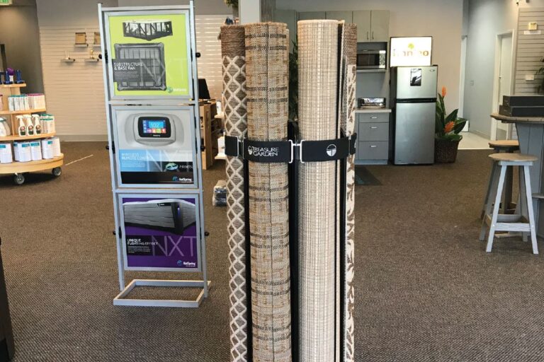
If all this seems too much, please don’t default to all-white walls. White ages poorly, shows all the dirt and gets dingy within a year. If you choose all white, plan to repaint yearly. Off whites age a little better. Look at Chantilly Lace, a softer white from Benjamin Moore and see if it works well under your lights. If white is your choice, paint a few focal walls to get people’s attention. A colorful focal wall is the perfect place to show a vendor story or a merchandise category such as barbecue tools, hot tub cleaning tools or backyard toys. Colors evoke emotional buying, while white keeps people in their heads, not their hearts.
Going back to green: It is an excellent addition to your color theme. Make your competitors green with envy at your stores’ growth and success.
I imagine you knew I was going to go there